Blue Futures
Client
JINDAL STEEL WORKS (JSW)
DELIVERABLES
Exhibition Identity Catalogue Design
Year
2025
Curators
Meera Curam Reha Sodhi Rajat Sodhi

The original mark functioned as a friendly, face-like badge, minimal and approachable, designed for a time when Botim was mainly about calling and chatting. The new icon shifts toward cleaner, system-driven geometry, using simplified forms to imply interaction and continuity, creating space for Botim to evolve from a messaging app into a full digital platform.
The original mark functioned as a friendly, face-like badge, minimal and approachable, designed for a time when Botim was mainly about calling and chatting. The new icon shifts toward cleaner, system-driven geometry, using simplified forms to imply interaction and continuity, creating space for Botim to evolve from a messaging app into a full digital platform.
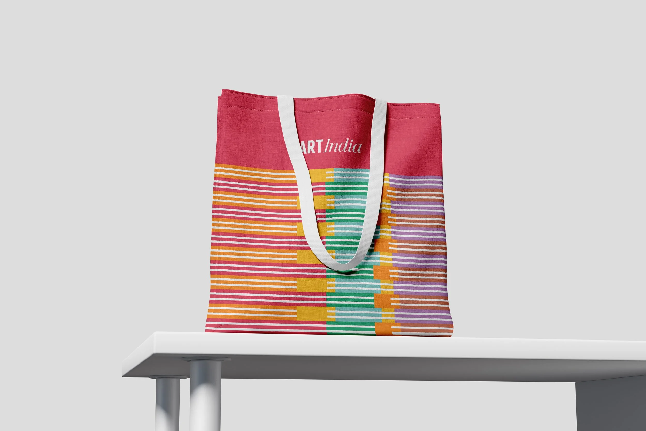
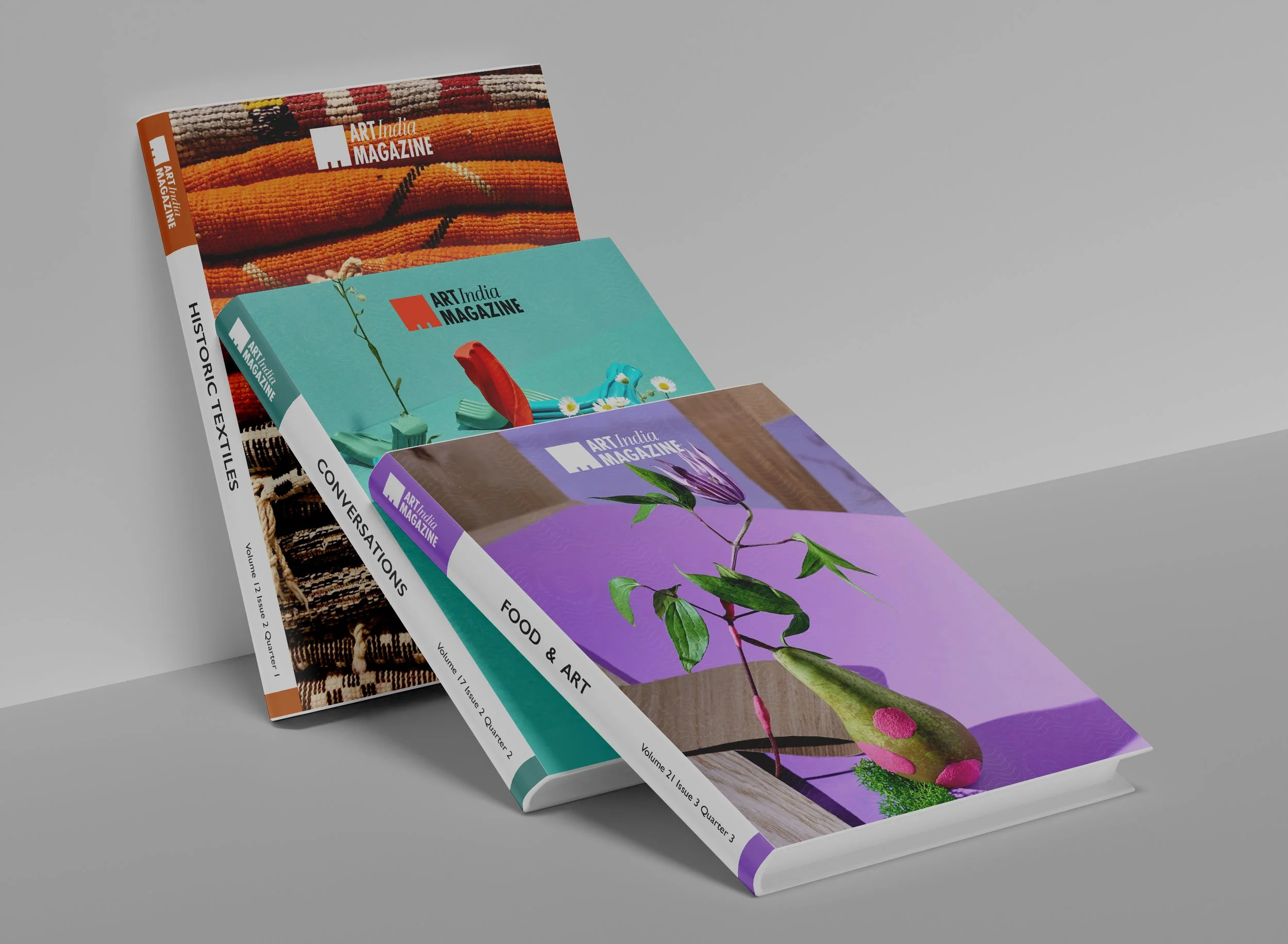
The redesigned brand identity showcases a bold and contemporary visual language, embodying the vibrancy and multifaceted nature of JSW and its contributions to art and culture. The design introduces a square logo, a potent symbol of Modern Art, which conveys both simplicity and order. This square serves as a transformative element, dynamically shifting to create representations for each vertical, such as Labs, Exhibitions, Education, Heritage Restoration, Publications, Technology, Grants, and Craft, effectively framing the brand's diverse offerings.
The redesigned brand identity showcases a bold and contemporary visual language, embodying the vibrancy and multifaceted nature of JSW and its contributions to art and culture. The design introduces a square logo, a potent symbol of Modern Art, which conveys both simplicity and order. This square serves as a transformative element, dynamically shifting to create representations for each vertical, such as Labs, Exhibitions, Education, Heritage Restoration, Publications, Technology, Grants, and Craft, effectively framing the brand's diverse offerings.
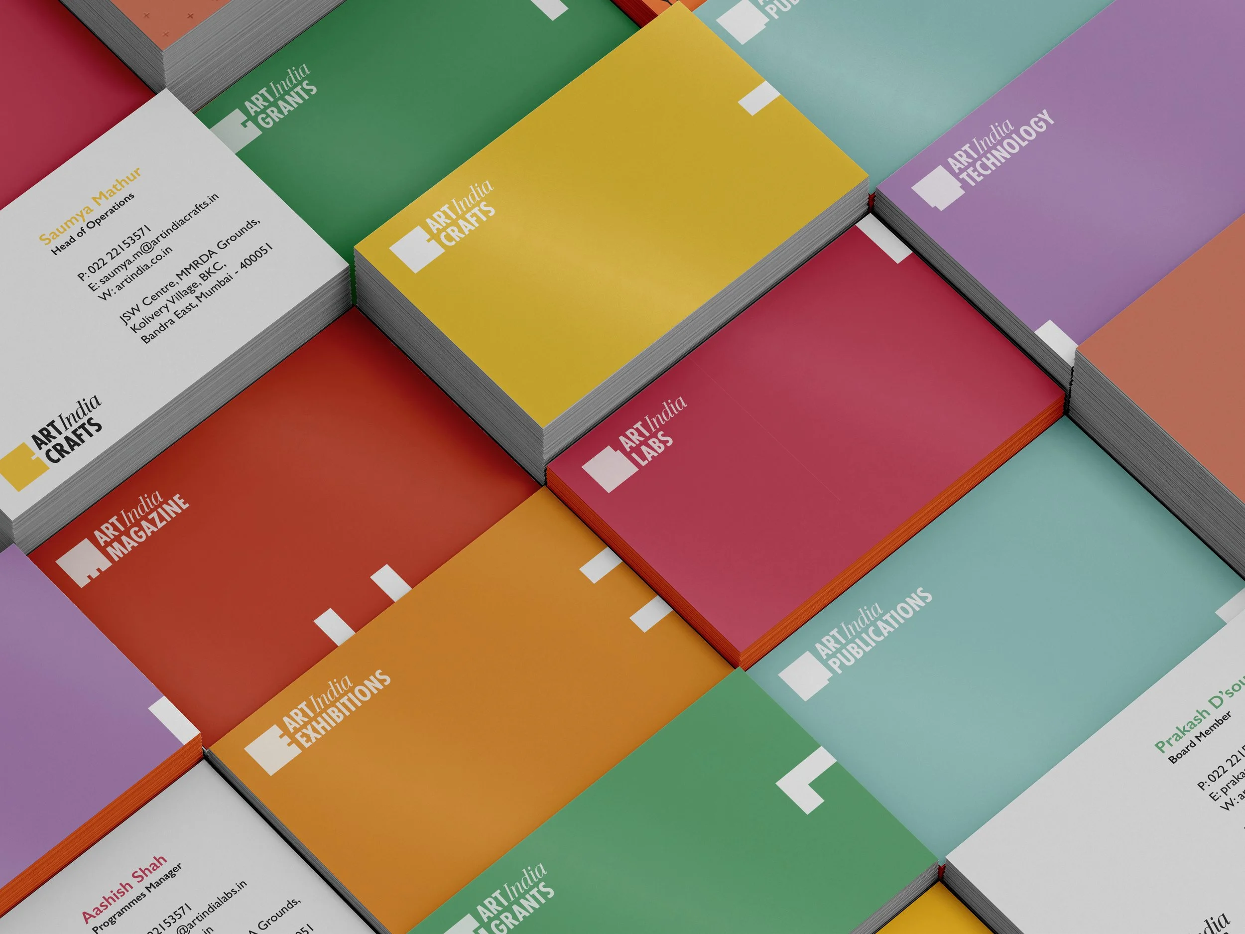
The logo leverages the interplay between negative and positive space, resulting in a playful contrast to the more traditional typographic components of the brand. This strategic design choice reflects Art India's adaptability and creative spirit while firmly establishing a cohesive visual identity recognized by its audience.
The logo leverages the interplay between negative and positive space, resulting in a playful contrast to the more traditional typographic components of the brand. This strategic design choice reflects Art India's adaptability and creative spirit while firmly establishing a cohesive visual identity recognized by its audience.